Final finish the Newsweek article Illustration, and I am happy the way it turned out. Me and my teacher came to the conclusion that I should add a body and a pacifier to the baby, just to strengthen the idea a little more. I've also have been working on concepts for a new series of illustration for my drawing class. More shots coming soon.
Sunday, October 11, 2009
Yep Yep
Final finish the Newsweek article Illustration, and I am happy the way it turned out. Me and my teacher came to the conclusion that I should add a body and a pacifier to the baby, just to strengthen the idea a little more. I've also have been working on concepts for a new series of illustration for my drawing class. More shots coming soon.
Tuesday, September 29, 2009
The Horror Final
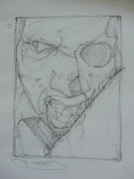
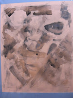
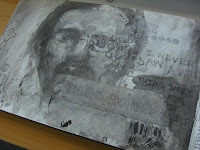
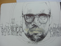
Were is the final black and white version of the disturbing self-portrait assignment. It was mad fun creating this image. Now, I have to recreate the same image in color with watercolor. I still have to make some adjustments in the image like defining the light source more and really pushing the value structure of the piece so the piece has a strong focal point and leads the eye around the composition.
Process shots of the race article assignment:
Monday, September 28, 2009
The Horror!!! (Process Shots)
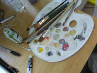
Here are a couple of process shots of an assignment I am working for my color works class. The assignment is that we have to create a self-portrait depicting the the disturbing side of our personality. I felt is this was go time to really GEEK out, and do something fun and bizarre. I am not really into horror, but with Halloween right around the corner I felt it was good time break out the zombies, rotten teeth and the chainsaw, what fun. Aside from that, I really starting to embrace the whole process of creating an image. From the thumbnail, to the work up sketch, to final piece.
Friday, September 25, 2009
First Assignment: RACE
For my first illustration assignment, I chose to an editorial piece on an a great article in the last weeks Newweek, which focused on how babies began at a very young age to discern race and the feelings they have about it. The tricky thing about tackle such a loaded topic as race is, is that it can be looked at from so many different points of view. So, how then, as an illustrator, do I try to create an image that racially sensitive and doesn't add to preexisting stereotypes and archetypes. My goal was to look at the topic objectively and try to arrive at the best possible solution, while balancing the content of the article and the things that we already associate with race and racism in america. It wasn't easy, but I am happy with the results.
Thumbnails:
I normally work up the ideas from the thumbnails in my sketchbook, to work out the concepts further and to work on any compositional problems. Then, I transfer the images from my sketchbook to tracing paper. The last idea is the one I am going to work up to a final piece for next week.
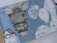
BACK AT IT!!!!
Thursday, June 4, 2009
Subscribe to:
Posts (Atom)